Graphs: Good, Bad, and Ugly
[33/100%]What is misleading about this graph of Affordable Care Enrollment created by a "trusted news source"?

This Census Bureau figure shows a leveling off of state and local property taxes. How would you improve this figure?

How would you improve this figure showing the number of Florida murders using firearms before and after the passage of Florida's "Stand Your Ground" law?

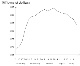
What is misleading about this figure accompanying a Los Angeles Times story that reported, "After peaking at billion in March, money market fund assets have fallen sharply"? How would the visual impression change if this misleading feature was corrected?
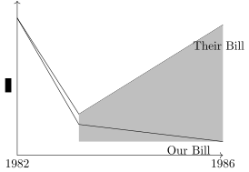
What is misleading about this figure that Ronald Reagan used to show how much middle-class Americans would save in taxes with the Republican proposal?
What is misleading about this National Science Foundation (NSF) figure showing a decline in Nobel Prizes awarded to Americans?

How would you improve this Washington Post figure showing median doctor income over time?

What do you find misleading about this graph, published on the front page of the Ithaca Times on December 7, 2000, evidently showing that Cornell students were paying more and getting less?

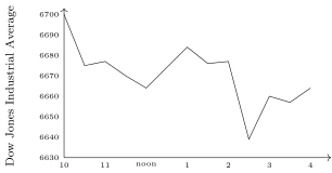
Explain why this Los Angeles Times graph of the Dow Jones Industrial Average of stock prices on January 27, 1997, gives a misleading visual impression of the volatility of stock prices that day:
The April 4, 2016, issue of Time magazine contained a full-page advertisement touting gold as an investment: "If you would have taken of your money and bought gold on September 6, 2001, then that initial purchase would have been worth over million exactly 10 years later on September 6, 2011!" As a statistician, what problem do you see with this evidence?

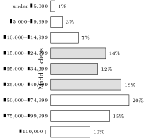
How would you redo this newspaper figure showing the US income distribution? Don't redraw it, just explain. Do you agree with their definition of the "middle class"?
This New York Times figure accompanied a David Frum article titled "Welcome, Nouveaux Riches." The figure shows a dramatic acceleration between 1980 and 1990 in the number of households earning more than a year. Frum wrote that, "Nothing like this immense crowd of wealthy people has been seen in the history of the planet." What problems do you see with this graph?

Identify as many problems as you can find with this figure from a Forbes article titled, "True Fact: The Lack of Pirates Is Causing Global Warming."

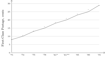
This figure from USA Today shows the eight increases in the cost of a first-class stamp between 1971 and 1991. Identify two distinct reasons why it is misleading.
How was the creator of this figure able to make it seem that Internet Explorer's declining market share had reduced the number of murders in the United States during this 5 -year period? What could the creator have done differently to make it seem that they were essentially unrelated?

Why, despite being labeled a histogram, is the following figure not a histogram?

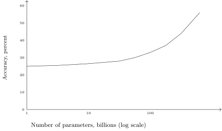
This figure was used to demonstrate that when the number of parameters in a large language model increases, there is a tipping point beyond which there is an explosive improvement in the model's performance. What unusual feature of this figure may cause the visual impression to be misleading?
An economist estimated the "location value" of 12 Native American gambling casinos in Southern California based on the driving distance for gambling households and the competition with other casinos. What problems do you see with this presentation of the results? How would you improve the presentation?

Historical data on the price of a box seat at Yankee Stadium were used to create this figure, which shows that the increase in ticket prices slowed down during the period of 1995-2010. What would you, as a statistician, say?

What is misleading about this figure that was used to show that real (inflation-adjusted) home prices are rising faster than real building costs?

An Internet company's CEO gave her Board of Directors a graph prepared by the company's finance group that showed the company's revenue over the previous seven quarters. The Board asked her to explain why revenue had fallen so much. How would you have responded?

In March 2015, a professor of Psychology and Music reported that musicians in traditional musical genres (like blues, jazz, country) live much longer than do musicians in relatively new genres (like metal, rap, hip hop). The professor concluded that performing in new genres was more dangerous than going to war: "People who go into rap music or hip hop or punk, they're in a much more occupational hazard profession compared to war. We don't lose half our army in a battle." Suggest a statistical explanation for why these data are misleading.

A researcher summarized a set of data with this histogram and box plot. Give two reasons why you know that the researcher made a mistake.

A researcher recorded annual Boston precipitation for 100 years, 18981997, and drew this "histogram" by calculating density as the precipitation each year divided by the total precipitation for all 100 years. Why is this not a histogram?

Explain how these Wall Street Journal graphs give the misleading impression that the improvements in math and reading scores were quite similar over this 4 -year period:
 Percentage Point Improvement in Test Scores

What is misleading about this graphic that accompanied a New York Times story about how discount fares were reducing travel-agent commissions?

Identify several problems that prevent this graphic from a college newspaper from conveying useful information:
Campus Poll Reveals Little Change in Perceived Safety How students responded when asked, "Do you feel safe on campus?"
 1= not safe at all \quad 5= completely safe
Why is this Washington Post figure a misleading depiction of the fact that prices (approximately) doubled between 1958 and 1978, halving the purchasing power of a dollar?
 1958 Eisenhower: $1.00
 1978 Carter: 44 cents
Without doing any calculations, explain why a pie chart and a bar chart would both be poor choices for displaying these data on the number of commercial banks of different sizes.
| Assets (Dollars) | Number of Banks |
|---|---|
| 0 to 50 million | 1,521 |
| 50 to 100 million | 756 |
| 100 to 500 million | 893 |
| 500 million to 1 billion | 1,104 |
| 1 to 10 billion | 765 |
| 10 to 50 billion | 102 |
| 50 to 100 billion | 16 |
| 100 to 3,500 billion | 33 |
For each of the following studies, identify the type of graph (one histogram, side-by-side box plots, one scatter diagram, or one time series graph) that would be MOST appropriate.
Have test scores in an introductory statistics class risen or fallen in the past 20 years?
Do colleges that accept a large percentage of their students in early-decision programs have higher yields (percentage of accepted students that enroll)?
Can starting salaries be predicted from college grade point averages?
Are final exam scores independent of homework scores?
Is there more dispersion in the starting salaries of economics majors or history majors?
For each of the following studies, identify the type of graph (one histogram, side-by-side box plots, one scatter diagram, or one time series graph) that would be MOST appropriate.
Are stock returns more volatile than bond returns?
Do interest rates affect home construction?
Can college grade point averages be predicted from high school grade point averages?
Do cigarette sales depend on cigarette prices?
Is the daily precipitation in January essentially the same in Chicago, Los Angeles, and New York?
For each of the following studies, identify the type of graph (one histogram, side-by-side box plots, one scatter diagram, or one time series graph) that would be MOST appropriate.
Do countries with lots of smokers have lots of lung-cancer deaths?
Does the time between eruptions of Old Faithful depend on the duration of the preceding eruption?
Do students who get more sleep get higher grades?
Has air pollution in Dallas generally risen or fallen during the past 20 years?
Could the state-by-state performance of Al Gore in the 2000 presidential election have been predicted from how well Bill Clinton did in each state in 1996?
For each of the following studies, identify the type of graph (one histogram, side-by-side box plots, one scatter diagram, or one time series graph) that would be MOST appropriate.
Are final exam scores normally distributed?
Does the incumbent party's chances of winning the presidential election depend on the national unemployment rate at the time of the election?
Is there more dispersion in midterm or final exam scores in an introductory statistics class?
Have temperatures in Los Angeles generally increased or decreased over the past 100 years?
Are final exam scores higher for students who sit in the front row or in the back row?